React Chat App Tutorial: Tailwind CSS
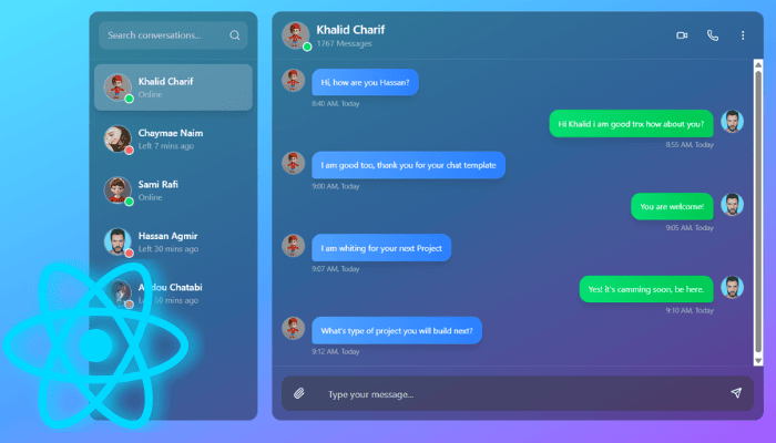
Building a sleek, interactive chat interface in React can be both fun and educational. The provided ChatApp component is a self‑contained, Tailwind‑styled chat UI that supports:
- A sidebar of contacts with online/offline indicators
- A scrollable chat history with sender and receiver bubbles
- Auto‑scroll to the newest message
- A “rich” header with actions (video call, voice call, dropdown menu)
- An auto‑resizing textarea for composing messages
- Keyboard shortcuts (Enter to send)
In the following sections, we’ll dissect each part—state management, UI components, event handlers, styling—and then wrap up with tips for taking this template further.
1. State & Refs: The Core Data
At the top of the component, several useState and useRef hooks are declared:
const [selectedContact, setSelectedContact] = useState(0);
const [message, setMessage] = useState('');
const [messages, setMessages] = useState([...initialMessages...]);
const [showDropdown, setShowDropdown] = useState(false);

const messagesEndRef = useRef(null);
const textareaRef = useRef(null);- selectedContact (number): index of the currently active contact in the sidebar
- message (string): the draft text being typed in the textarea
- messages (array): list of chat messages, each with id, text, sender, time, and avatar
- showDropdown (boolean): controls visibility of the header’s “More” menu
- messagesEndRef (ref): dummy <div> at the bottom of the chat window, used to scroll into view
- textareaRef (ref): reference to the composing <textarea>, for auto‑resizing
By lifting these bits of state to the top, all subcomponents (message bubbles, header, input area) can read and update data in a single source of truth.
2. Contact Data & Sidebar
A static array of contact objects drives the left‑hand sidebar:
const contacts = [
  { id: 1, name: 'Khalid Charif', avatar: '…', status: 'Online', isOnline: true, messageCount: 1767 },
  // …more contacts
];
ContactItem Component
const ContactItem = ({ contact, isActive, onClick }) => (
  <div className={`p-4 cursor-pointer … ${isActive ? 'bg-white/20' : 'hover:bg-white/10'}`}
       onClick={onClick}>
    <div className='flex items-center space-x-3'>
      {/* Avatar with online/offline dot */}
      {/* Name and status */}
    </div>
  </div>
);- Props
- contact: metadata (avatar URL, name, status)
- isActive: boolean to highlight the selected contact
- onClick: handler to switch selectedContact
- Styling
- Uses Tailwind classes for padding, rounding, hover effects, and soft shadows
- The online dot is a small div with conditional bg-green-400 or bg-red-400
The sidebar maps contacts to ContactItem, passing index === selectedContact for the highlight.
3. Chat Header: Actions & Dropdown
Above the chat messages, a header shows the active contact’s avatar, name, status/count, and action buttons:
<div className='flex items-center justify-between p-4 border-b border-white/10'>
  <div className='flex items-center space-x-3'>
    <img src={contacts[selectedContact].avatar} … />
    <div>
      <h3>{contacts[selectedContact].name}</h3>
      <p>{contacts[selectedContact].messageCount || contacts[selectedContact].status}</p>
    </div>
  </div>
  <div className='flex items-center space-x-4'>
    <Video />, <Phone />, and a MoreVertical button
  </div>
</div>- Video & Phone Icons: placeholder buttons for future call functionality
- MoreVertical Icon: toggles the showDropdown state
DropdownMenu Component
const DropdownMenu = () => (
  <div className={`absolute right-0 top-full … ${showDropdown ? 'opacity-100' : 'opacity-0'}`}>
    <div className='px-4 py-2 hover:bg-white/10 cursor-pointer flex items-center'>
      <User size={16} /><span>View profile</span>
    </div>
    {/* … other items: Add to friends, Block, etc. */}
  </div>
);- Positioned absolutely under the “More” button
- Transitions for fade-in/slide-down using Tailwind’s utility classes
4. Messages Area: Mapping Data to Bubbles
const Message = ({ message }) => {
  const isUser = message.sender === 'user';
  return (
    <div className={`flex items-start space-x-3 mb-6 ${isUser ? 'justify-end' : ''}`}>
      {!isUser && <img src={message.avatar} … />}
      <div className='relative max-w-xs lg:max-w-md'>
        <div className={`px-4 py-3 rounded-2xl shadow-lg ${
            isUser ? 'bg-gradient-to-r from-green-400 …' : 'bg-gradient-to-r from-blue-400 …'
        }`}>
          <p className='text-sm leading-relaxed'>{message.text}</p>
        </div>
        <span className={`absolute -bottom-5 text-xs text-gray-300 ${
            isUser ? 'right-0' : 'left-0'
        }`}>
          {message.time}, Today
        </span>
      </div>
      {isUser && <img src={message.avatar} … />}
    </div>
  );
};- Logic
- Checks message.sender to decide alignment and coloring
- User messages align to the right and use a green gradient; contact messages align left with blue
- Timestamp
- Placed absolutely below each bubble, showing the time and a “Today” tag
Auto‑Scroll on New Message
const scrollToBottom = () => {
  messagesEndRef.current?.scrollIntoView({ behavior: 'smooth' });
};

useEffect(() => {
  scrollToBottom();
}, [messages]);
Each time messages changes, the effect calls scrollToBottom, which brings the dummy <div ref={messagesEndRef} /> into view.
5. Message Input: Auto‑Resizing & Keyboard Handling
The bottom of the chat window holds the attachment button, textarea, and send button:
<textarea
  ref={textareaRef}
  value={message}
  onChange={handleTextareaChange}
  onKeyPress={handleKeyPress}
  placeholder='Type your message…'
  className='flex-1 bg-transparent text-white … resize-none'
  rows='1'
/>
<button onClick={handleSendMessage}><Send size={20} /></button>
Auto‑Resize Logic
const handleTextareaChange = (e) => {
  setMessage(e.target.value);
  const textarea = e.target;
  textarea.style.height = 'auto';
  textarea.style.height = Math.min(textarea.scrollHeight, 128) + 'px';
};- Temporarily resets height to auto, then grows to fit content (max 128px)
- Ensures the input area expands as the user types multiple lines
Send on Enter
const handleKeyPress = (e) => {
  if (e.key === 'Enter' && !e.shiftKey) {
    e.preventDefault();
    handleSendMessage();
  }
};- Pressing Enter (without Shift) submits the message
- Shift+Enter still inserts a new line
6. Sending a Message
const handleSendMessage = () => {
  if (message.trim()) {
    const newMessage = { id: …, text: message, sender: 'user', time: new Date().toLocaleTimeString(…), avatar: … };
    setMessages([...messages, newMessage]);
    setMessage('');
    if (textareaRef.current) textareaRef.current.style.height = 'auto';
  }
};- Guards against blank messages
- Builds a new message object with current time and user avatar
- Appends to the messages array, triggering re‑render and auto‑scroll
- Resets textarea content and height
7. Layout & Styling
- Overall Container: full‑screen gradient background (from-cyan-300 via-blue-400 to-purple-500)
- Flexbox: divides screen into sidebar (25%–33%) and chat area
- Backdrop‑blur & Opacity: semi‑transparent black panels (bg-black/40 backdrop-blur-lg)
- Rounded Corners: rounded-2xl, rounded-xl, and smooth shadows for depth
- Scrollbars: scrollbar-thin on lists for a polished look
All styling is achieved purely via Tailwind utility classes—no external CSS files.
8. Customization & Next Steps
- Dynamic Data Source
- Replace the hard‑coded contacts and initial messages with data fetched from an API (e.g., via useEffect + fetch/Axios).
- WebSocket Integration
- Swap the local messages state for a real‑time socket (Socket.io or Firebase) to push and receive messages live.
- Profile & Settings
- Wire up the dropdown menu actions (View Profile, Block, Add to Group) to actual modals or navigation routes.
- Media Attachments
- Extend the Paperclip button to open a file picker, upload images/files, and render attachments inline.
- Theming
- Parameterize colors and fonts to allow light/dark mode or user‑custom themes.
- Accessibility
- Add ARIA attributes, ensure focus management and keyboard navigation for full accessibility compliance.
- Pagination & Infinite Scroll
- For long chat histories, implement “load more” at the top or virtualized list for performance.
Conclusion
This ChatApp template is a robust starting point for any real‑time messaging UI in React. You’ve seen how state, refs, and effects combine to:
- Manage contact selection
- Render dynamic message bubbles
- Auto‑scroll to new content
- Handle text input and keyboard shortcuts
- Layer in polished Tailwind styling
With a few integrations—real data, push notifications, file handling—you can evolve this from a static demo into a fully‑featured chat application.